Problem
The product combines architecture, security and engineering. The interface therefore needs to create desire first, then reveal the system in chapters without collapsing into a technical brochure.
Live standalone website shown through real responsive states, narrative details and a directly verifiable public URL.
View project↗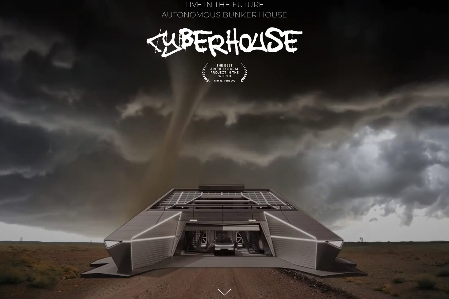
Problem and solution
The product combines architecture, security and engineering. The interface therefore needs to create desire first, then reveal the system in chapters without collapsing into a technical brochure.
A long-form cinematic website that turns a complex autonomous residence into a controlled digital product narrative across desktop, tablet and mobile.
Built the page rhythm around cinematic entry, progressive disclosure and clear narrative chapters.
Research
I separated the autonomous residence into legible chapters: idea, protection, autonomy, engineering and living experience. This preserved cinematic impact without losing substance.
A technical product is easier to understand through progressive disclosure than through one wall of specifications.
The live page opens as a cinematic product story for an autonomous bunker house rather than a conventional architecture catalogue.
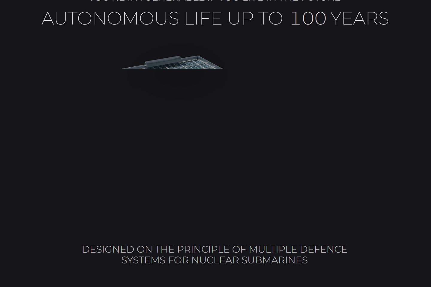
The narrative moves from the award-led hero into autonomous life, defence systems and engineering arguments.
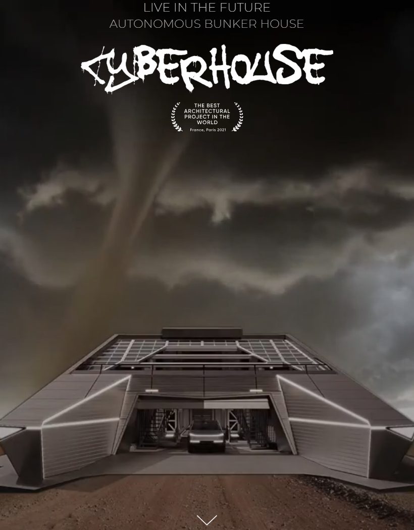
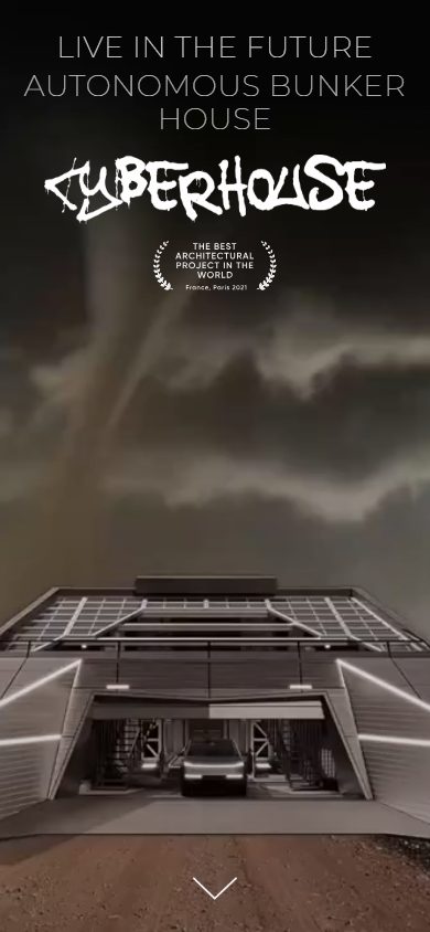
The responsive capture passed at desktop, tablet and mobile widths without horizontal overflow.
All interface images in this case are direct captures of the live URL, not generated device placeholders.
Information architecture
The page alternates emotional and evidence-led episodes to sustain a long-form journey.
Built the page rhythm around cinematic entry, progressive disclosure and clear narrative chapters.
Aligned visual scale, typography and media sequencing with the futuristic architecture proposition.
Prepared and checked the responsive experience as three distinct compositions rather than one desktop page reduced to mobile.
Visual concept
The mockup does not disguise the interface: environment, colour, scale and medium extend the logic of the project itself.
Black field and fine technical typography
Media as a sequence of chapters
Distinct pacing for desktop, tablet and mobile
Design and system behaviour
Each visual is tied to a journey stage and demonstrates a distinct part of the solution.
Validation and outcome
Live standalone website shown through real responsive states, narrative details and a directly verifiable public URL.
Live source: cyberhouse-bunker.com is linked directly from the case.
Desktop, tablet and mobile captures were produced from the live URL at 1440, 820 and 390 px.
The automated capture found no horizontal overflow at any of the three widths.
Agency work is credited to Lex Wizhevsky Architects.
The CyberHouse brand, architecture and project authorship are not presented as Alexandra's independent property.
Discuss a related project
Send the current surface, goal and constraints. I will propose a route from diagnosis to a verifiable release.
Discuss a related project↗